01
Semantic structure.
Pages use meaningful headings, navigation regions, main content, sections, buttons, links, labels, and other appropriate HTML elements.
Accessibility / Everybody Gets The Assignment
Accessible design helps more people navigate, understand, read, and interact with the website without unnecessary barriers.
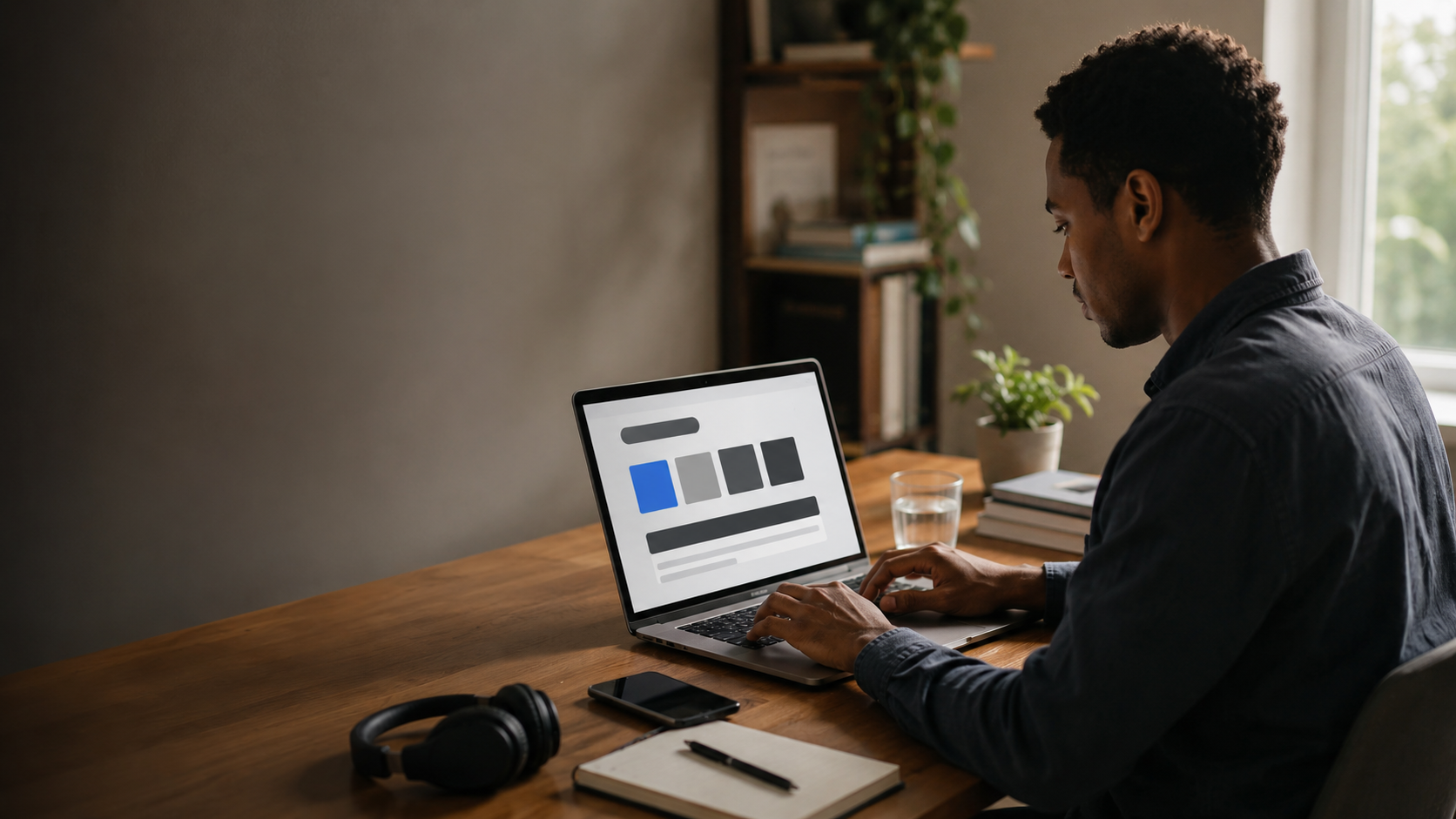
usable is part of the design
Template Notice / Audit After Customization
This template includes accessibility-minded structure and design patterns, but every customized website must be reviewed after content, colors, images, forms, plugins, embeds, and third-party services are added.
Accessibility requirements may vary according to the business, location, audience, services, and applicable law.
accessibility badge ≠ accessibility audit
Commitment / Remove The Barriers We Can
The website should support visitors with different ways of seeing, hearing, moving, navigating, reading, understanding, and interacting with digital content.
Accessibility is not a decorative feature. It should be considered when writing content, choosing colors, building navigation, creating forms, adding media, and updating the website.
"works for me" is not a testing methodology
Accessibility / Four Useful Questions
Important information should not depend on one sense, one color, or one presentation method.
Interactive features should be usable without requiring one specific input method.
Navigation, instructions, labels, and content should make sense without requiring detective work.
The underlying structure should work with modern browsers, assistive technologies, and different devices.
Built In / The Template Has Already Started The Homework
These features provide a useful starting point, but they still need to survive customization and real-world testing.
Pages use meaningful headings, navigation regions, main content, sections, buttons, links, labels, and other appropriate HTML elements.
Navigation and interactive controls are intended to remain usable without depending entirely on a mouse.
Interactive elements include visible focus treatment so keyboard users can identify where they are on the page.
Motion-sensitive visitors should not be forced through unnecessary animation when reduced-motion preferences are enabled.
Accessibility Whiteboard / Tiny But Important Test
Website Says
Color has been removed from its position as sole information provider.
Content & Media / Describe The Thing
Images
Meaningful images should have text alternatives appropriate to their purpose and context. Decorative images should not create unnecessary screen-reader noise.
Video & Audio
If video or audio is added, review captions, transcripts, audio descriptions, controls, and other appropriate alternatives.
Documents
Downloadable documents, worksheets, study guides, schedules, and other files should also be reviewed for accessibility.
Forms / Please Label The Boxes
Form fields should have understandable labels, instructions, required-field information, and useful error feedback.
Visitors should be able to navigate form controls with a keyboard and understand what information each field requests.
If the form processor, spam protection, scheduling system, payment tool, or another third-party service changes, test the finished experience again.
mystery field #4 has been discontinued
Visual Design / Readable Is Still Aesthetic
Text, controls, and important interface elements should maintain sufficient visual contrast against their backgrounds.
Content should remain understandable when visitors enlarge text or zoom the page.
Content should adapt across screen sizes without requiring unnecessary horizontal navigation.
Important instructions should not rely entirely on color, position, shape, or visual styling.
Third Parties / They Can Break Things Too
Scheduling systems, payment processors, maps, embedded videos, chat tools, social-media content, form services, and other third-party features may introduce accessibility barriers outside the template's original code.
Review those services before launch and whenever they are replaced or substantially updated.
iframe entered the chat
Testing / The Browser Preview Is Not The Final Exam
Navigate through links, buttons, menus, forms, and other interactive controls without using a mouse.
Check enlarged content and multiple viewport sizes for overlap, clipping, disappearing controls, and unreadable layouts.
Where appropriate, test representative pages and critical workflows with relevant assistive technologies.
Automated tools can identify some accessibility problems, but they should not be treated as the entire evaluation.
Accessibility Reality Check
Automated Scan Says
A tool score is not a substitute for an accessibility review.
Feedback / Tell Us Where The Wall Is
Provide visitors with a reliable way to report accessibility problems or request assistance.
When reporting a problem, useful information may include the page involved, the feature that caused difficulty, the browser or device being used, and a description of what happened.
Do not require someone to diagnose the technical cause before asking for help.
"this button does not work for me" is enough to start investigating
Accessibility Contact / Replace This
Replace the demonstration details below with the business's actual accessibility contact information.
Email:
accessibility@yourtutoringbusiness.com
Business Name:
Your Tutoring Business
If a visitor cannot access information or complete an important task, provide another reasonable method of obtaining assistance.
Before Launch / Accessibility Audit
Review headings, navigation, keyboard behavior, focus states, color contrast, images, alternative text, forms, error messages, buttons, links, zoom behavior, motion, documents, videos, third-party tools, and critical customer workflows.
Replace the demonstration contact details, remove statements that do not apply, and do not publish a conformance claim unless the finished website has been evaluated appropriately.
test after customization. yes, again.
Back To Tutoring / Website Homework Complete
Return to tutoring information or contact the business if you need help accessing the site.