
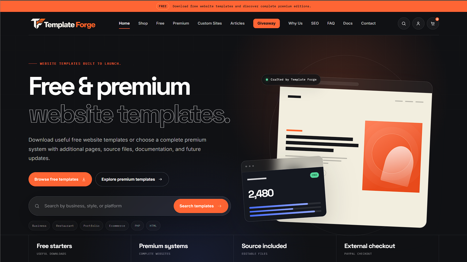
I kept looking at Template Forge and thinking the same thing: the site still works, it is clean, it is fast, and there is nothing technically wrong with it, so why the hell am I getting tired of looking at it? Then it clicked. I had started seeing versions of our own design everywhere.
Dark backgrounds, one bright accent color, giant headlines, little monospace labels, rounded cards, pill-shaped buttons, browser mockups, subtle grids, floating dashboards and some glowing thing in the corner that apparently has to be there or the startup will collapse. None of those things are automatically bad design. The problem is that they have become the default vocabulary for so many AI-generated and AI-assisted websites that a custom-built site using the same language can now look like it came straight out of a generator.
That is exactly what happened to us, and the annoying part is that we did not use an AI website builder to create Template Forge. We made the decisions, built the pages, adjusted the layouts and had reasons for why things looked the way they did. Then the design trend caught up with us so hard that explaining who got there first became completely irrelevant. Nobody visiting the site knows the history of our CSS. They just know what the page looks like right now.
The black, white and orange were not random.
Template Forge has always leaned heavily on black, white and orange, and there was an actual reason for all three. The dark background gave the site some weight and made it feel closer to a design and development environment than a generic ecommerce store. White handled most of the information because it gave us strong contrast and kept everything readable. Orange gave us the personality.
Orange also made sense for the name before we ever got into the usual branding conversation about attention and calls to action. It is Template Forge. Heat, sparks, metal, building something. Orange belongs there. It gave us a color that could attract attention without needing to cover the entire website, so we used it for active states, buttons, labels and the parts of the page where we actually wanted your eye to go.
We never wanted the site to look like somebody found the orange hex code in the logo and dumped it over every object on the page. The color was supposed to mean something when it showed up.
The store had to frame the work without fighting with it.
There is another reason the storefront stayed fairly dark and neutral: our products are websites. Every template has its own colors, typography, images and personality, and some of them are intentionally nothing like Template Forge. One might be bright and loud, another might be soft and expensive-looking, and another might look like somebody spent three business days deciding whether the background should be ivory, cream or "warm porcelain."
If the storefront had a huge personality in every square inch, the products would have to compete with the site selling them. That is why the darker interface made sense. Template Forge was supposed to provide the frame while the templates provided most of the color.
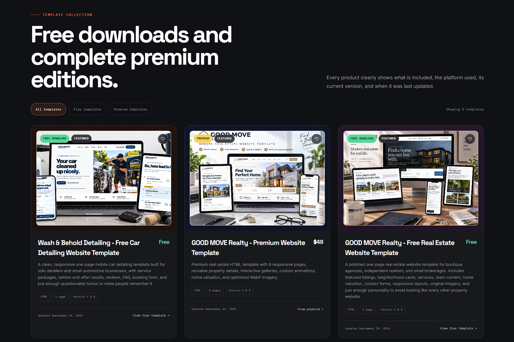
That part still makes sense to me. What changed is the visual environment around it. A dark technology storefront used to communicate something more specific. Now you can throw a rock at the internet and hit six of them before it lands.
Orange actually had a job.
The free-versus-premium section is probably the easiest place to see what I mean. The free option sits on a restrained dark card, while the premium option gets the full orange treatment. That is not just decoration. The premium product is larger, more complete and more involved, so it gets more visual weight before you even start reading the list underneath it.
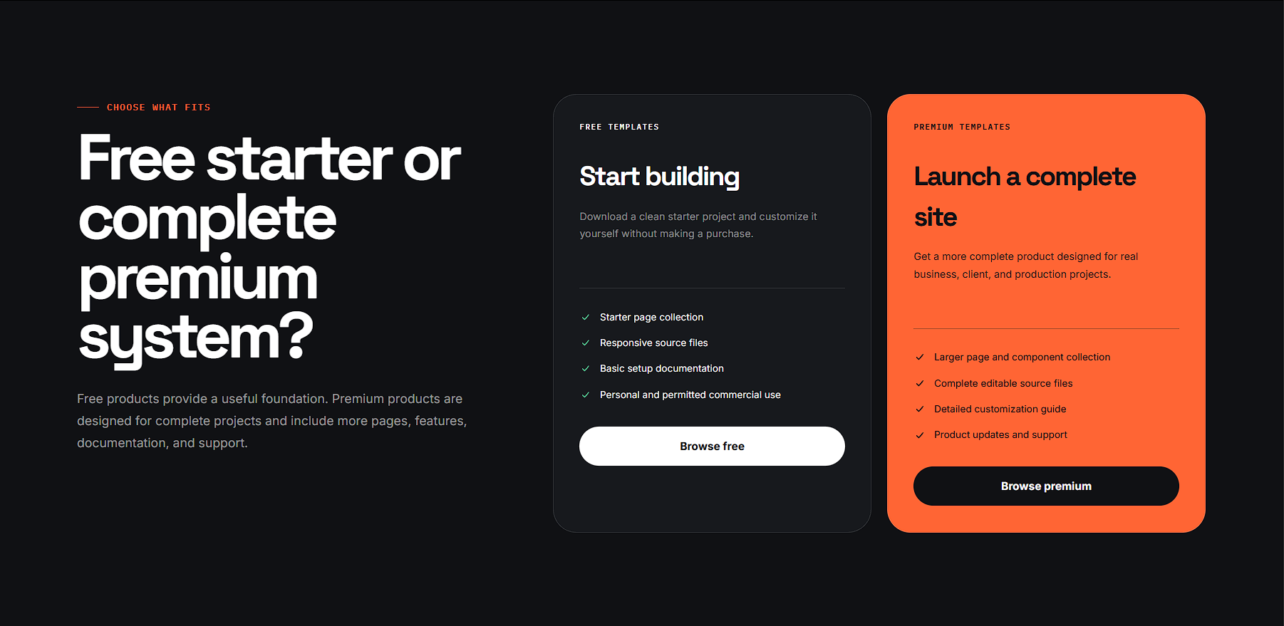
Nobody looks at that section and thinks, "Excellent chromatic hierarchy." At least I hope not, because that sounds exhausting. You just understand which option carries more weight. That is the whole point. Good design decisions are usually invisible when they are working.
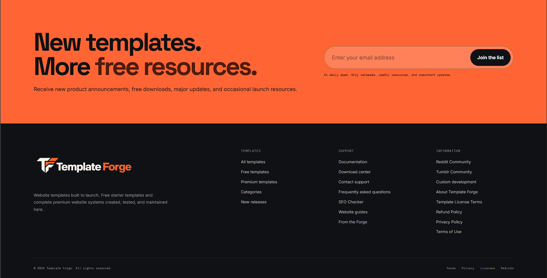
The same thing happens farther down the page with the newsletter section. Orange is mostly restrained throughout the site, so when an entire section finally turns orange it actually interrupts the page. You have finished browsing, the product content is over and we have one last thing to ask before the footer. That section is allowed to be loud because the rest of the site has not spent the previous ten minutes screaming at you.
Then every website started showing up wearing the same outfit.
Somewhere along the way, all of those individual design choices turned into a starter pack. You know the site before I even describe it: giant headline, dark background, purple or orange glow, floating dashboard, three feature cards explaining that the product is seamless, powerful and built for you, and a tiny pill near the top announcing V2.0 even though nobody knows what the hell happened to V1.0. Scroll a little farther and there is a bento grid because of course there is.
Again, none of those things are bad by themselves. Rounded cards work. Large typography works. Dark backgrounds work. Clean navigation works. The problem is repetition. When the same ingredients keep showing up in the same proportions, design stops saying much about the company and starts looking like a costume anybody can put on.
That is the part that finally bothered me about Template Forge. We did not suddenly have a bad website. We had a website whose visual language had become generic around it, which is a much stranger problem because technically nothing has to break for that to happen. The site can be exactly the same site it was yesterday and still mean something different because the rest of the internet changed.
AI is not really the problem. Taking the first answer is.
It would be easy to turn this into another "AI is ruining everything" article, but that would be bullshit. We use AI. It helps with research, debugging, brainstorming, writing, testing ideas and plenty of other work. I am not going to sit here pretending modern tools are evil while using modern tools. That is not the point.
The problem is letting the tool become the creative director. Ask an AI website builder for a modern technology company and it has to give you something, so naturally it starts with patterns that are familiar, safe and broadly usable. That makes complete sense. What does not make sense is accepting the first answer without asking why any of it belongs to your business.
Why is that color there? Does that section need to be inside a card? Does every button need to look like a vitamin? Does this company actually talk like that? Does the giant glowing blob mean anything, or did it just arrive with the furniture? Those are the questions that disappear when the process becomes generate, publish, done.
Do that enough times across enough websites and the safest answer becomes the dominant answer. That is how we ended up in the ridiculous position of having a custom-built website that can still look AI-generated. We did not copy the trend. The trend caught up with us, and at this point that distinction only matters if we can show the thinking behind the work.
So we are changing the relationship between everything.
We are not throwing away black, orange or strong typography. Those things still belong to Template Forge. We are also not replacing the entire site with twelve shades of beige, a picture of somebody drinking coffee near a MacBook and a headline that says "Elevate Your Digital Presence." I would rather shut the server off.
What we are changing is how heavily the site depends on the patterns that now scream "modern tech website." Some areas can get lighter. Orange can become more selective. The templates can provide even more of the visual personality. Typography and spacing can create hierarchy without requiring another floating rounded rectangle behind everything.
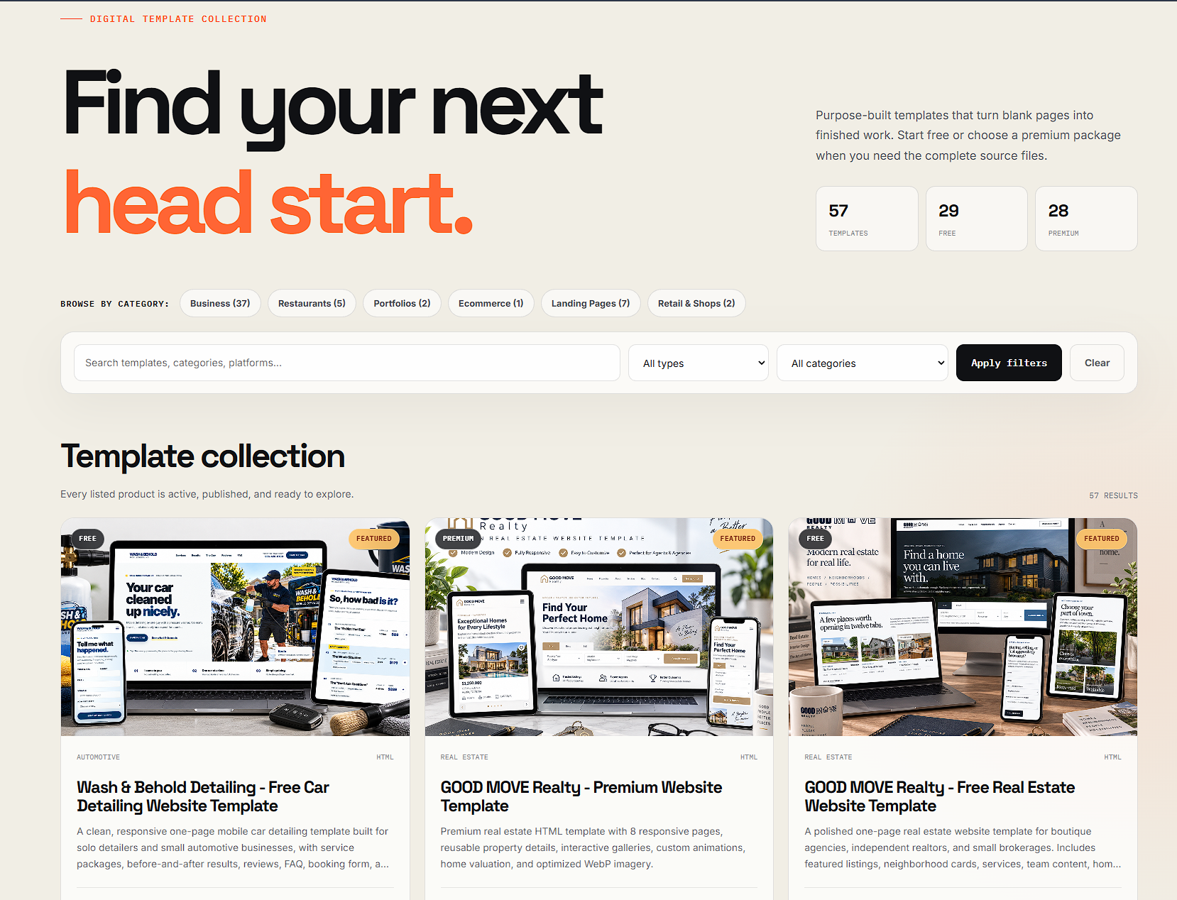
I like this lighter direction because it proves something else we needed to prove to ourselves: a brand is not a paint bucket. If changing the background from black to a warm light tone makes the entire identity disappear, then we never really had an identity. We had a color scheme.
Template Forge should still feel like Template Forge because of the combination of typography, contrast, spacing, the way the products are presented, the way we write, the orange when it matters and the fact that the site does not take itself too seriously. We should not need to dunk every section in the same three colors just to prove the logo still belongs there.
The old design was not a mistake, and the redesign is not an apology.
I do not want to do that thing companies always do during a redesign where they suddenly act like the previous version was garbage and the new one has finally discovered the concept of whitespace. The current site did what we wanted it to do, and a lot of it still works. That is exactly why this redesign is more interesting than fixing something that was obviously broken.
Sometimes you redesign because the business changed. Sometimes the technology changed. Sometimes the old site just sucks. And sometimes the site is fine, but the visual culture around it changed so much that your design no longer communicates what it used to. That is the situation we are in.
Good design does not exist in isolation. A choice can be thoughtful when you make it and still become generic later because everybody else started speaking the same visual language.
Saying "we did not use an AI website builder" is not enough.
We could put a badge in the footer that says HAND CODED or NO AI WEBSITE BUILDER, but anybody can type that sentence. It does not prove much. There is no special HTML smell that tells a visitor whether somebody actually thought about the design before the page was built.
I would rather show the work. Here is the old homepage. Here is why we used black. Here is why orange mattered. Here is why the product grid stayed neutral. Here is why the premium card got more color. Here is what started feeling generic, what we still think works and what we are changing now.
That is also a more honest way to talk about AI. We use AI as a tool, and I am not interested in pretending otherwise. What we did not do is hand the company to a website generator and let it decide what Template Forge should look like. There is a pretty big difference between using a tool during the work and letting the tool make the creative decisions for you.
The goal is not to make a website nobody has ever seen before.
Websites share patterns because some patterns work. Navigation should be understandable. Buttons should look clickable. People should be able to find the shop without solving a puzzle. Nobody gets extra design points for moving the shopping cart into the bottom-left corner and making it spin when you hover over it.
What I want is much simpler. When somebody lands on Template Forge, I want it to feel like Template Forge, not Generic Startup Website #4,817 and not the default output of whatever AI website builder launched this month. If we do this redesign right, we should not have to tell people the site has its own point of view. They should be able to see it.